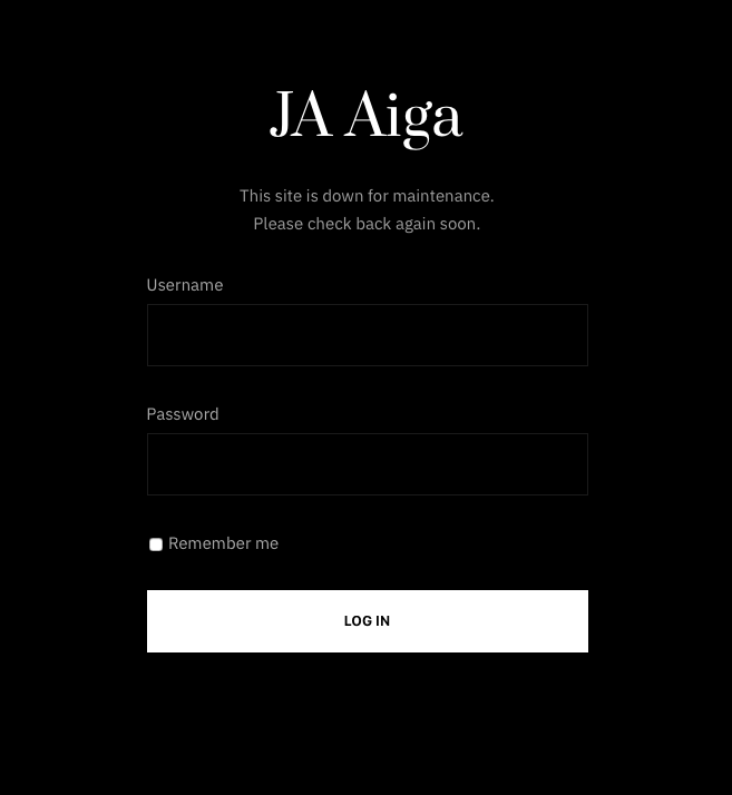
Nagle dostrzegłam, że wszystko dokoła jest fascynujące. Ale dopiero na fotografii. – Joanna Helander

Each JA Joomla Template has its own matching Offline page. Below is the screenshot of Offline page style.

Each JA Joomla Template has its own matching 404 page. Below is the screenshot of 404 page style.

9 Home Page Variations.

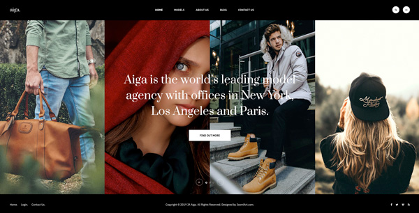
Multiple styles and layouts for Homepage: split, columns, minimal and fashion magazine with different animation for slideshow and more.

Home Split

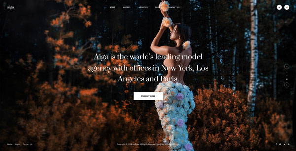
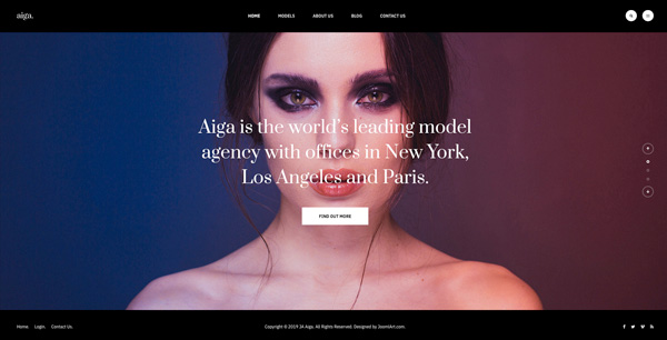
Beautiful one screen slideshow with transparent background for menu and footer with split animation when scrolling up and down.

Home Split Classic

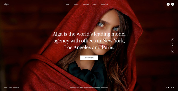
Classic style for one page split home page with header, footer and beautiful slideshow using split animation.

Home Slideshow

One screen homepage with slideshow, transparent header and footer.

Home Split 2 col

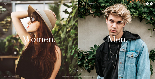
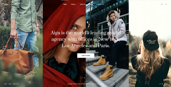
One screen homepage with 2 columns slideshow using split animation, transparent header and footer.

Home Columns

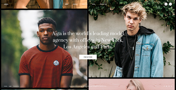
One screen homepage with multiple columns slideshow using left and right navigation, transparent header and footer.

Home Columns Classic

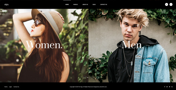
Classic one screen homepage with multiple columns slideshow using left and right navigation, header and footer.

Home Minimal

One screen home page using minimal slideshow style, transparent header and footer.

Home Minimal Classic

One screen home page using classic minimal slideshow style.

Home Magazine

Dedicated layout for fashion magazine to show latest fashion news.

5 Model Page Variations.

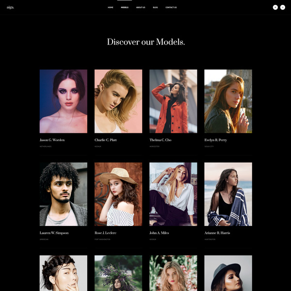
Show model articles in clean and well structured layout with multiple views for model details page to represents content in smart ways.

View Models

Show models list in clean and well structure layout with images, names and Job title.

Model Detail Centered

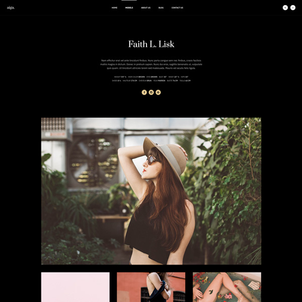
Model detail page with center content section, featured image and additional images.

Model Detail Cover Simple

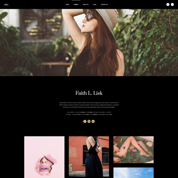
Model detail page with featured image on top center content section and additional images shown as a gallery.

Model Detail Cover

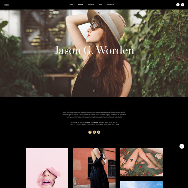
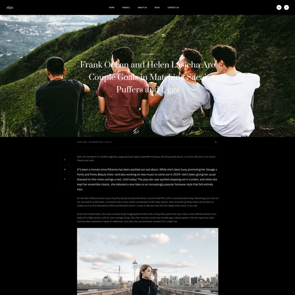
Model detail page with full screen featured image on top with title, center content section and additional images shown as a gallery in container.

Model Detail Split

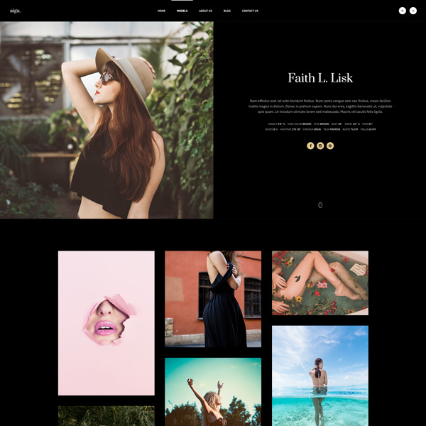
Model detail page with full screen section divided into 2 columns: featured image and Model content. The image gallery section is shown in container.

9 Blog Page Variations.

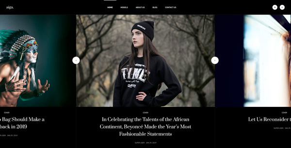
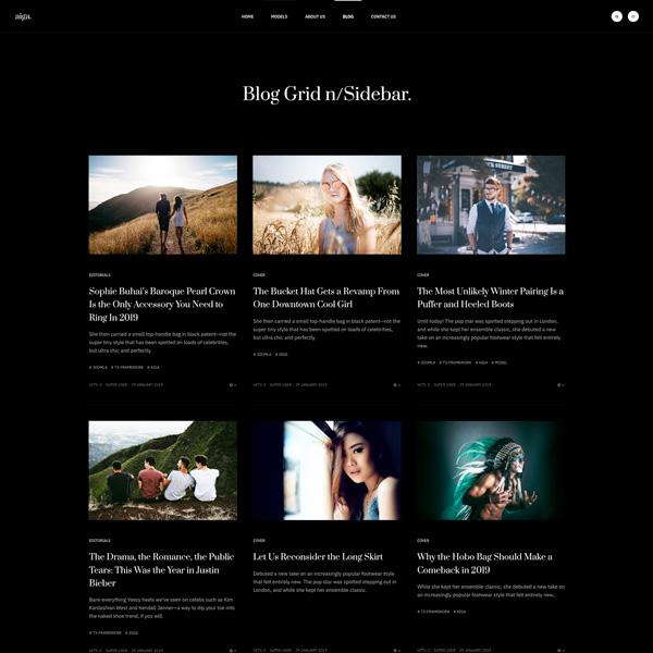
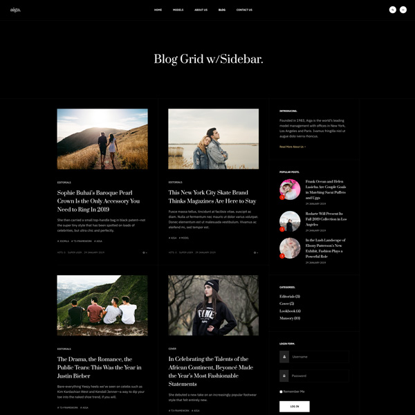
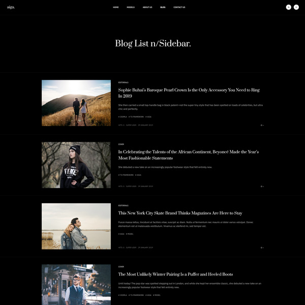
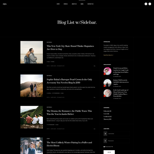
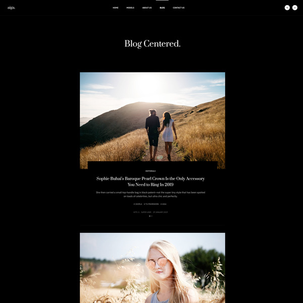
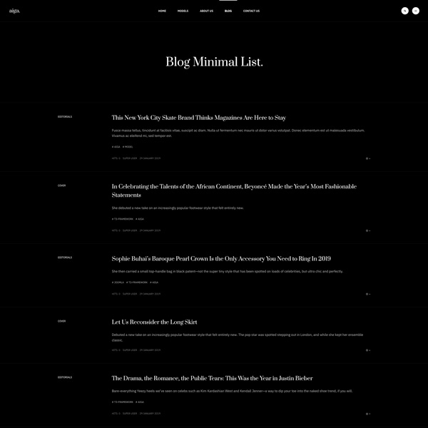
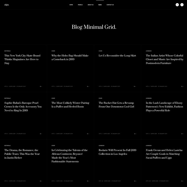
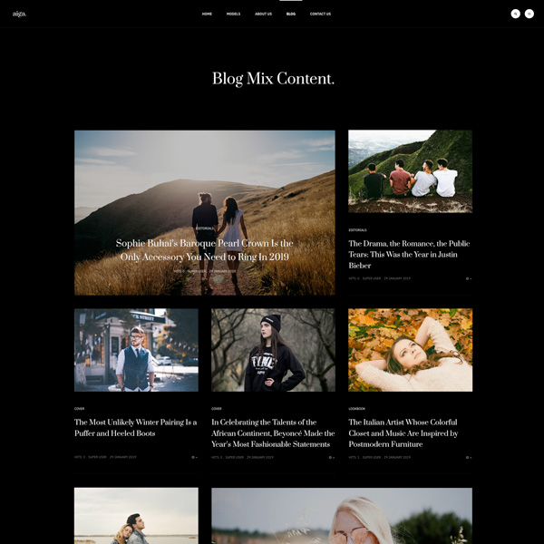
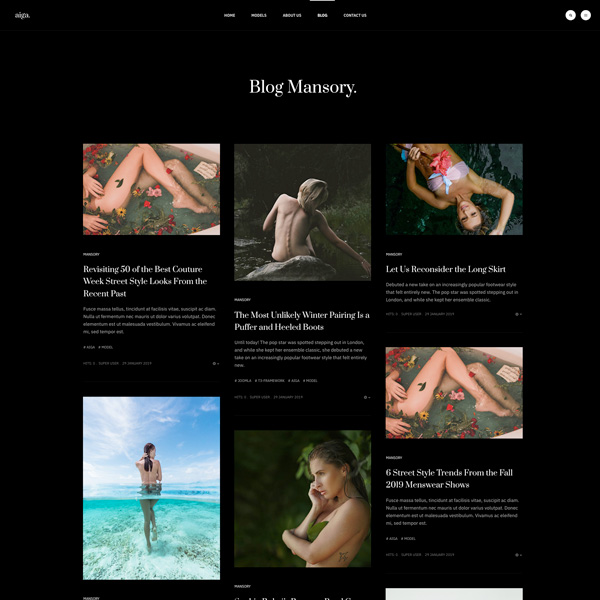
Multiple blog layouts and style: grid layout, list layout, minimal and mix content layout to show content your ways.

Blog Grid n/Sidebar.

Show blog items in grid layout without sidebar.

Blog Grid w/ Sidebar.

Show blog items in grid layout with right sidebar.

Blog List n/Sidebar

Show blog items in list layout without sidebar.

Blog List w/Sidebar

Show blog items in list layout with right sidebar.

Blog Centered

Show blog items in one column layout with center content alignment.

Blog Minimal List.

Show blog items in clean and minimal list layout.

Blog Minimal Grid.

Show blog items in clean and minimal grid layout.

Blog Mix List.

Show blog items in grid layout with special style for featured articles.

Blog Mansory

Show blog items in mansory layout.

6 Joomla Article Variations.

Show article content in outstanding pre-made layouts with super simple configuration.

Default

Default Article detail page with one column layout without sidebar

Default W/Sidebar

Article detail page with right sidebar

Article Cover

Article detail page with full cover image with title and content section in container

Article Cover Sidebar

Article detail page with full cover image and sidebar

Article Cover Simple

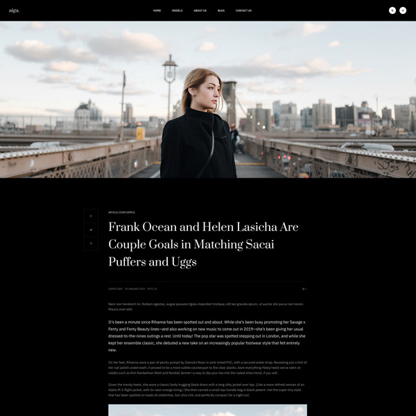
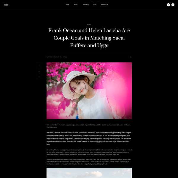
Article detail page with full cover image, no sidebar, title and content in container

Article Cover Simple Sidebar

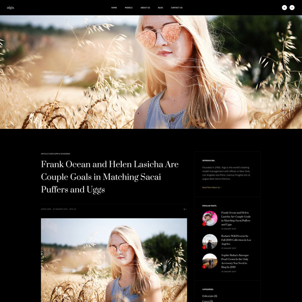
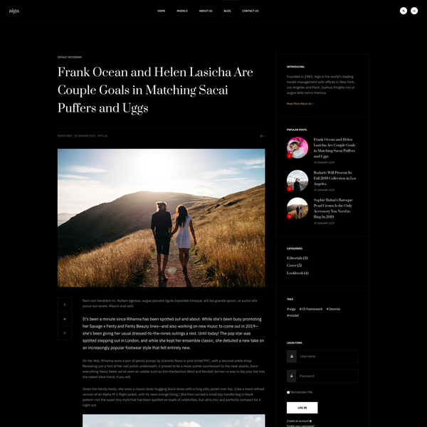
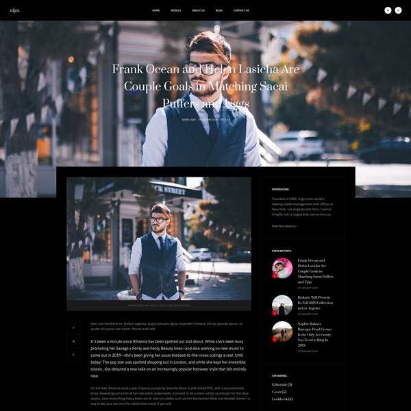
Article detail page with full cover image, right or left sidebar, title and content in container

Heading Text

h1. Heading Secondary text

h2. Heading Secondary text

h3. Heading Secondary text

h4. Heading Secondary text

h5. Heading Secondary text
h6. Heading Secondary text

TIPS: Create lighter, secondary text in any heading with a generic <small> tag or the .small class.

Example body text

This is a lead paragraph.
Make a paragraph stand out by adding .lead.

Maecenas sed diam eget risus varius blandit sit amet non magna. Donec id elit non mi porta gravida at eget metus.

Nullam quis risus eget urna mollis ornare vel eu leo. Cum sociis natoque penatibus et magnis dis parturient montes, nascetur ridiculus mus. Nullam id dolor id nibh ultricies vehicula.

The following snippet of text is rendered as bold text.

The following snippet of text is rendered as italicized text.

An abbreviation of the word attribute is attr.

Address

Company Name
795 Folsom Ave, Suite 600
San Francisco, CA 94107
P: (123) 456-7890
Full Name
P: (123) 456-7890
Ten adres pocztowy jest chroniony przed spamowaniem. Aby go zobaczyć, konieczne jest włączenie w przeglądarce obsługi JavaScript.

Emphasis classes

This is a .mute paragraph.

This is a .text-primary paragraph.

This is a .text-warning paragraph.

This is a .text-danger paragraph.

This is a .text-success paragraph.

This is a .text-info paragraph.

Alignment classes

This is a left aligned text .text-left

This is a center aligned text .text-center

This is a right aligned text .text-right

This is a justify aligned text which is often used in Book Design, Magazine or special Typo Pages. Create a justify aligned text with .text-justify class.

Blockquotes

Lorem ipsum dolor sit amet, consectetur adipiscing elit. Integer posuere erat a ante.

Quote's author in Source Title

Color Swatches

Brand Colors

#dec180
Brand Primary
#428bca
Brand Secondary
#f0ad4e
Brand Warning
#d9534f
Brand Danger
#5bc0de
Brand Info
#5cb85c
Brand Success

Grayscale Levels

#1a1a1a
Gray Darker
#252525
Gray Dark
#666
Gray
#888888
Gray Light
#eee
Gray Lighter
#f7f7f7
Gray Lightest


Navigations

Tabs

In the area of graphical user interfaces (GUI), a tabbed document interface (TDI) or a Tab is one that allows multiple documents to be contained within a single window, using tabs as a navigational widget for switching between sets of documents. It is an interface style most commonly associated with web browsers, web applications, text editors, and preference panes.

GUI tabs are modeled after traditional card tabs inserted in paper files or card indexes (in keeping with the desktop metaphor).

Inputs

Indicators

Alerts and Notifications

Error message title

Cras ac dignissim mauris. Duis odio diam, rutrum ut est at, scelerisque malesuada risus.

Sussess message title

Cras ac dignissim mauris. Duis odio diam, rutrum ut est at, scelerisque malesuada risus.

Info message title

Cras ac dignissim mauris. Duis odio diam, rutrum ut est at, scelerisque malesuada risus.

Warning message title

Cras ac dignissim mauris. Duis odio diam, rutrum ut est at, scelerisque malesuada risus.

Labels

Default Primary Success Info Warning Danger

Misc

List groups

  • 14 Cras justo odio
  • 2 Dapibus ac facilisis in
  • Morbi leo risus
  • 1 Morbi leo risus
  • 2 Dapibus ac facilisis in

List group item heading

Donec id elit non mi porta gravida at eget metus risus varius blandit.

List group item heading

Donec id elit non mi porta gravida at eget metus.

List group item heading

Donec id elit non mi porta gravida at eget metus.

Panels

Panel heading

Panel content

Panel primary

Panel content

Panel success

Panel content

Panel warning

Panel content

Panel danger

Panel content

Panel info

Panel content

Wells

Look, I'm in a small well!
Look, I'm in a well!
Look, I'm in a large well!